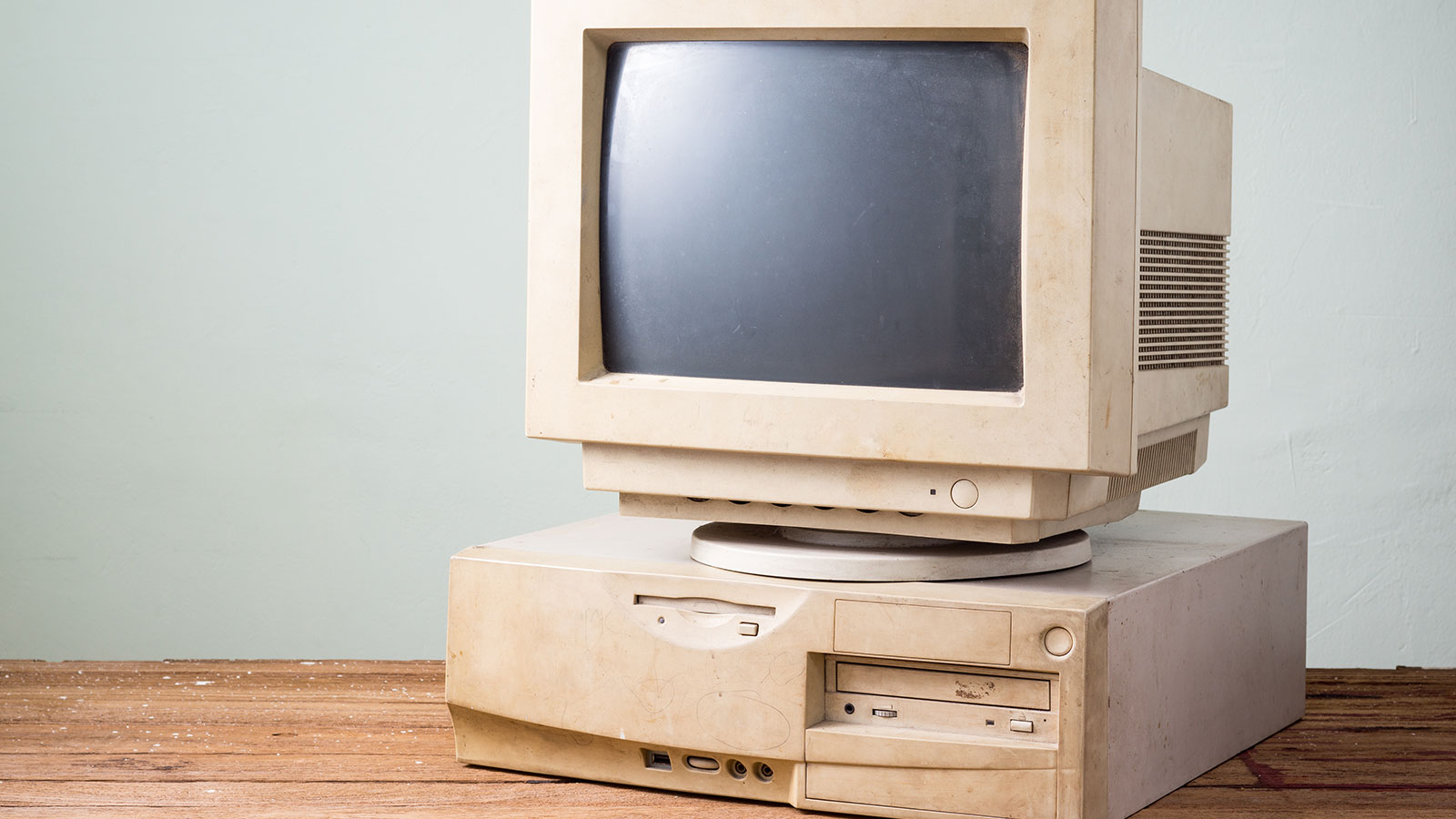
7 Signs Your Website is Out of Date
There are two types of website owners. Some understand that a website should be the centre of your online universe. It shouldn’t just be attractive but pertinent and informative. It should funnel leads and prospects to you. Your social media and promotional materials should point to it. It should be a vibrant force in your online marketing efforts.
Then, some had their teenage cousin create their website years ago. It likely hasn’t been updated since. It is prone to error messages and spam and hasn’t produced a lead in months or years. Owners of these websites will complain that internet marketing doesn’t work “for them”. They probably haven’t visited their own website in years and are too embarrassed to have others view it. Here are 7 ways your website may be screaming, “Help me, I am out of date!”

An Out of Date Copyright.
One of the easiest to spot tell-tale ways your website is shouting “Out of date!” is a copyright year that is not current. Back in the day, these types of texts had to be manually updated, but today, there are apps for that. There should be no excuse for an outdated copyright date; if your website has one, please fix it.
It is Not Mobile Capable.
Pew Research now says that about 80% of Americans own a smartphone. When you look at the 18-34 demographic, that number climbs to over 95%. These smartphone owners use their devices to look up news, information, and reviews and shop for goods and services. Your website should be designed to be responsive to smartphones, with essential information like location and contact data upfront and easy to find. Many smartphone users are “ready to buy” but will move on quickly if their information is hard to find or see. Make sure you view your website on a mobile device and make the necessary changes to make it appealing when seen on a smartphone.
Contains Outdated Information.
A website’s content can show it is behind the times in many ways. There could be older dates on news releases or outdated blogs. The content itself may tell readers in more subtle ways. For example, your primary page copy may say “Serving our customers since 2005” but also “In our ten years in business”. This can be avoided by using evergreen content on your website, especially if keeping it updated may be a challenge for you.

It has a Look that is so 2000
It is hard to imagine that the year 2000 was almost two decades ago. Your website may look like it. It may be boxy, slow loading, and use giant navigation buttons. You know it when you see it. If your website looks vintage 2000, your potential customers will move on.
It Doesn’t Link Your Social Media Accounts.
Modern, well-designed websites should make connecting with your organisation as simple as possible. This includes logos and links to your various social media sites like Facebook, X (Twitter), LinkedIn, Instagram, Pinterest, Snapchat, and more. Websites that don’t include their social media links can appear out-of-touch. You’re also not taking full advantage of the valuable synergy your social media and website can build.
Uses Flash or Java
Patience has grown increasingly thin when waiting for websites to load. Outdated software like Java and Flash can drag your website down. If you will use video, consider using an off-site service like YouTube. Ensure popular web browsers like Google Chrome support all software used on your website.
Not Using an Eco Web Hosting Company.
One of the ways you can demonstrate you are connected to what’s important today is by choosing an eco-web hosting service that offers environmentally friendly features. How will your users know you use a “green” web hosting company? At OrangeWebsite, we offer all of our clients access to free banners that can be easily installed on their website pages. These banners tell visitors they are working with an organization that cares about the planet. It is not only the right thing to do. It is a terrific way to attract like-minded prospects and customers.
What Makes OrangeWebsite Eco-Friendly?
The story of OrangeWebsite.com starts with our location in Iceland. Ours is a country that gets just about 100% of its electric energy from renewable resources like hydroelectric and geothermal. Because our data centre is in a cool climate, we can use much less energy to condition the air for our servers. We even offer employees the ability to work remotely from home, using less fuel for work travel and keeping more cars off the road. This form of web hosting has been referred to as organic because it is better for our planet.
If your website needs an overhaul, maybe it is time to start with an eco-friendly hosting company that offers hosting plans to fit any organization’s size. Iceland has a superior technological infrastructure with quick load times to North America and Europe. We have clients in over 100 countries across the globe. We offer anonymous web hosting with a 99.9% uptime guarantee, and payments can be made by Bitcoin, PayPal, cash by mail or wire transfer. We are an ultra-secure hosting company that minimizes the data we keep on our clients. We even provide a 30-day, money back guarantee to ensure your satisfaction.
Is your website screaming for help? You should start with a fresh new design and include valuable content. Of course, you’ll want it to be mobile-capable and easy to maintain. You should also consider starting with green hosting from OrangeWebsite. Contact us today to learn more!
